
Accessible Website Design: Practical First Steps
Five concrete, code-level accessibility improvements—from keyboard focus and heading order to form labels and motion preferences—that immediately improve usability.
By Pixel Primes Editorial Team
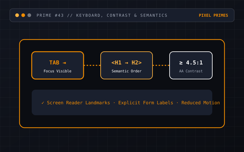
Accessibility is core engineering quality, not an add-on
Web accessibility ensures that people with diverse visual, motor, auditory or cognitive abilities can perceive, navigate and interact with your website. Just as importantly, accessible practices—like high-contrast typography, clear focus states and explicit form labels—make websites easier for everyone to use on mobile screens, in bright glare or when multitasking.
If your team wants to make meaningful progress toward WCAG 2.1 / 2.2 Level AA without feeling overwhelmed, start with these five foundational areas in your templates.
1. Test your site with the Tab key alone
Unplug or set aside your mouse for five minutes and navigate your homepage, main menu and contact form using only the `Tab`, `Shift + Tab`, `Enter` and `Escape` keys. Can you always see exactly which link or button currently has focus? Can you open and close the mobile menu? Or does the focus ring disappear because someone wrote `outline: none` in the CSS?
Use the modern `:focus-visible` selector to render a clear, high-contrast outline around focused controls for keyboard users.
2. Use real semantic HTML elements
A `<div>` with an `onClick` handler is not a button: it cannot be focused by keyboard, does not respond to the Space/Enter keys by default, and tells a screen reader nothing about its role. Use native `<button>` elements for actions, `<a href="...">` for navigation to a URL, and logical heading levels (`<h1>` followed by `<h2>` and `<h3>`) that outline the page structure.
3. Pair every form input with a visible label and clear error text
Placeholder text inside an input box vanishes the moment a user starts typing, leaving them to guess what format was required. Always bind a persistent `<label>` to each input and provide clear, polite text instructions when validation fails.
- →Ensure colour contrast between body text and background meets at least 4.5:1 (and 3:1 for large headings and UI boundaries).
- →Write descriptive link text ("Explore UI/UX Design services") rather than ambiguous "Click here" or "Read more" links.
- →Respect `prefers-reduced-motion: reduce` so users sensitive to parallax or rapid canvas animations receive a calm experience.
Moving beyond automated scores
Automated browser tools are great for catching missing `alt` attributes or contrast ratios, but they only detect roughly 30–40% of real usability barriers. Pairing automated checks with manual keyboard walkthroughs and dedicated Website Accessibility Improvements ensures your critical customer journeys genuinely work.
Have a question about your project?
Talk directly with the designers and engineers at Pixel Primes Pty. Ltd.