
How Better UX Can Improve Website Enquiries
Why qualified visitors leave without getting in touch—and how clearer information architecture, specific service framing and calmer forms turn traffic into genuine enquiries.
By Pixel Primes Editorial Team
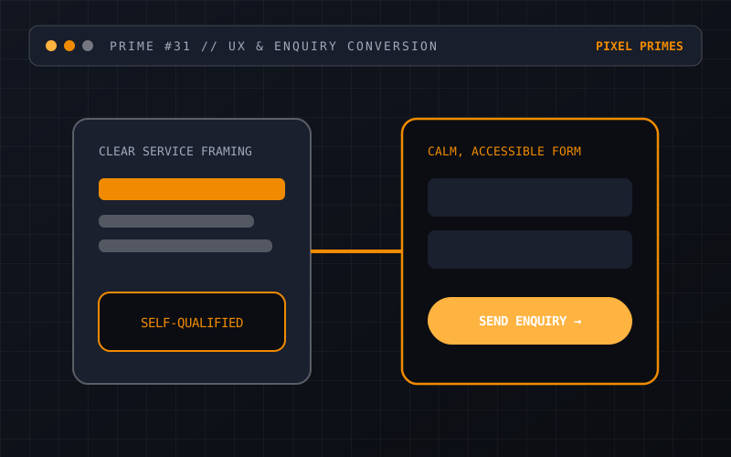
Why visitors hesitate before submitting an enquiry
When a business wants more website enquiries, the first instinct is často to add louder call-to-action buttons, pop-up modals or urgency banners. Yet in practice, prospective customers rarely leave because they failed to notice a button. They leave because they could not quickly answer three foundational questions: Does this company solve my specific problem? How do they work? What happens after I fill in this form?
User experience (UX) design addresses those questions structurally. Instead of treating conversion as a visual trick at the bottom of a page, good UX treats the entire journey—from landing on a service page to reading the confirmation message—as a sequence of clarity checks.
1. Replace vague slogans with specific service framing
Many commercial homepages open with abstract headlines about "transforming digital futures" or "empowering next-generation synergy". A time-poor buyer comparing three providers has to click through multiple menus just to figure out whether you build web applications, run marketing campaigns or sell hardware.
State what you do, who it is for and what problems it solves in plain language within the first screen. When visitors immediately recognise their own situation in your copy, cognitive load drops and they stay to read the details.
- →Name the concrete service category and primary outcomes above the fold.
- →List what is included—and just as importantly, any scope boundaries—so visitors can self-qualify.
- →Link directly from high-level overview cards to dedicated service detail pages.
2. Structure navigation around buyer questions, not internal org charts
Internal teams often group navigation menus by their own department names or proprietary terminology. External visitors, however, search by problem or task. Keep top-level navigation calm and predictable: Services, About, Blog, FAQs and Contact cover the vast majority of commercial journeys.
On mobile devices, ensure the menu button is easy to reach with a thumb, opens without layout lag and reveals direct links rather than nested three-level accordions.
3. Design enquiry forms that respect the user’s time
Nothing derails a high-intent visitor faster than a twelve-field form asking for budget codes, company ABN and mandatory phone extensions before a first conversation. Every extra required field introduces friction and error potential, especially on mobile keyboards.
Ask only for what you genuinely need to reply helpfully—typically name, email, optional topic selection and a plain-text message box. Pair each input with a visible, persistent `<label>` (never rely on disappearing placeholder text alone) and explain clearly when the user can expect a reply.
- →Use appropriate HTML input types (`type="email"`, `autocomplete="name"`) so mobile keyboards offer the right layout.
- →Validate fields politely on submit with clear text descriptions rather than cryptic red borders.
- →Include a plain-language privacy and consent statement right next to the submit button.
Where to start on your own site
Try completing an enquiry on your own website using a mobile phone over a standard cellular connection. Watch where you have to pinch-zoom, guess what a link means or re-type a form field. Fixing those structural rough edges through thoughtful UI/UX design and solid website development is one of the most reliable ways to lift enquiry quality.
Have a question about your project?
Talk directly with the designers and engineers at Pixel Primes Pty. Ltd.