
Why a Design System Helps Growing Digital Products
How shared tokens, accessible component primitives and clear usage rules stop UI drift and help small-to-mid-sized teams ship features faster.
By Pixel Primes Editorial Team
The hidden tax of "just one more screen"
When a digital product is brand new, speed comes from improvisation. A designer sketches a screen, an engineer styles it, and the feature ships. Six months later, however, the codebase has four slightly different shades of blue, three modal implementations—only one of which closes when pressing the Escape key—and form inputs that look different on the settings page than on the checkout page.
Every new feature starts taking longer because designers and developers have to negotiate basic layout rules from scratch on every ticket. That friction is what a design system removes.
What a pragmatic design system actually contains
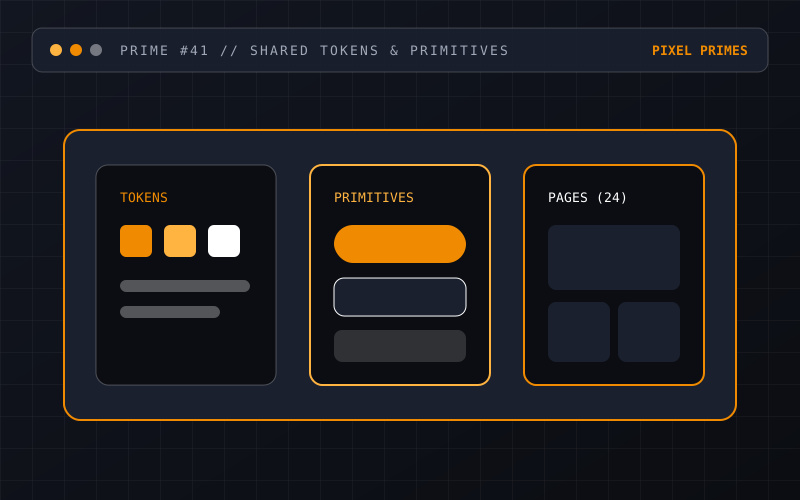
A design system does not need to be a massive corporate encyclopaedia maintained by a dedicated twenty-person team. For most growing software products and multi-page websites, a high-leverage system rests on three practical layers:
- →Design Tokens: Named variables for colour roles (`--bg`, `--surface`, `--fg`, `--accent`), typography scales, spacing units and border radii shared between Figma and CSS.
- →Core Primitives: A focused set of 15 to 25 coded UI components (Buttons, Inputs, Selects, Cards, Dialogs, Badges, Tables) with all states handled.
- →Composition Guidelines: Short, practical rules explaining when to use which component and how to combine them into page templates.
Solving accessibility and responsiveness once
Building an accessible dropdown menu or modal dialog from scratch requires careful attention to keyboard arrow navigation, focus trapping, `aria-expanded` attributes, screen-reader announcements and mobile touch targets. Expecting engineers to remember and re-test all of those details under deadline pressure on every new feature is unrealistic.
When those behaviours are baked into a shared Design System component, every new page that imports `<Dialog />` or `<FormField />` inherits keyboard accessibility, focus rings and high-contrast support automatically.
Closing the gap between Figma and production code
A style guide that only lives in a static PDF or a disconnected design file quickly goes stale. The real value unlocks when Figma component properties mirror the TypeScript props of your Frontend Application components. Handover shifts from measuring pixel distances to referencing shared token and component names.
Have a question about your project?
Talk directly with the designers and engineers at Pixel Primes Pty. Ltd.